- R: G: B:
- R: G: B:
- R: G: B:
Americas Job Exchange
Re-invisioning Comcast's OFCCP compliance and outreach employment company.
Many products - one message.
Americas Job Exchange's mission is to reduce the complexity for their clients in reaching OFCCP compliance. Its hard to understand Americas Job Exchange, their various products and how they lend value to their clients, their misison and what they do. It was our job to make understanding easier and to tie all their products into one cohesive look that would be immediately familiar to their clients.
Step 1: Simplfy the name
“Americas Job Exchange” - its a mouthful. Especially when you need to say it multiple times in a day so we reduced their name to a moniker "AJE". If we had a nickel for every time we were thanked for this - we would have well over a dollar.
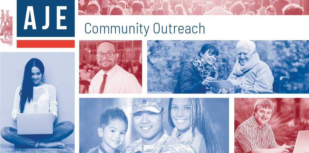
Step 2: Identify and Unify
We created a new simplified logo that identifies to national pride using the main colors and symmetry that is reminiscient of the American flag. The red white and blue color palette is enforced throughout all materials to unify while diverse pictures of people in group settings are used to effect a feeling that people are not alone and that AJE is here to help.
Step 3: Extend
AJE's ancillary product lines stick to the primary color palette blue while adding a custom tertiary color to signify that products signaute palette within the AKE eco-system. This strategy allows for extension of the product line while keeping the look and fell consistent when folding in new products to the AJE ecosystem.
Americas Job Exchaange

Disability Job Exchaange
